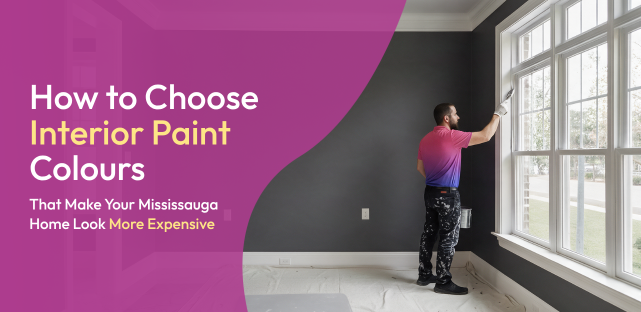
There is a specific look that certain homes have, the kind where nothing shouts for attention, but everything feels considered. You have probably walked into a place like that and thought it looked expensive without being able to point to exactly why. Most of the time, the answer is paint, or more specifically, a colour palette that was chosen with some real thought instead of picked in a rush at the hardware store. Working through this kind of decision is exactly where professional painters can save you from an expensive trial-and-error process.
Mississauga has a wide mix of housing, from older character homes to newer builds with big open layouts, and the paint colours that make any of them look upscale are more about strategy than budget. This guide covers how to actually choose colours that give your home that quiet, expensive feel, room by room.
Key Takeaways
- Warm neutrals, soft whites, and greige tend to read as more expensive than bright or trendy colours.
- A cohesive colour palette across connected rooms does more for a luxury look than any single standout wall.
- Natural light direction should guide your colour choice, not just the shade you like on a chip.
- Paint colour needs to work with your existing hardwood floors, trim, and furniture, not just the walls on their own.
- Dark colours can absolutely look luxurious, but only when used with intention rather than everywhere at once.
What Paint Colours Make a Mississauga Home Look More Expensive?
Expensive-looking homes tend to lean on a fairly narrow, disciplined colour palette rather than a different bright colour in every room. A few families of colour show up again and again in interiors that read as upscale, and getting this part right is one of the most common things our residential painting clients in Mississauga ask us to help plan out before any brush touches a wall.
Warm Neutrals
Warm neutrals are the backbone of most high-end interiors. They feel calm and grounded rather than trendy, and they age well, which matters if you are not planning to repaint every couple of years. A warm neutral in the living room in particular tends to photograph and feel more sophisticated than a bold accent colour.
Soft Whites and Off-White
Soft white and off-white tones give a room a clean, considered look without feeling cold or clinical. These work especially well as a base colour that lets furniture, art, and architectural details stand out rather than competing with a busy wall colour.
Greige and Beige
Greige sits between grey and beige, and it has become a favourite in upscale interiors because it reads as modern without losing warmth. Beige, when chosen with the right undertone, offers a similar effect, especially in homes with warm wood floors or trim.
Earthy Tones and Muted Green
Deeper earthy tones and a muted green bring in colour without looking loud. These work particularly well as an accent wall or in a room with strong architectural character, since they add depth without pulling focus from the room itself.
Are Warm Whites or Greige Better for a Luxury-Looking Interior?
Both can work beautifully, and the better option usually comes down to your home’s lighting and existing finishes rather than one being objectively superior.
- Warm white tends to suit homes with a lot of natural light and warm wood tones, since it stays soft rather than sterile.
- Greige works well in homes that want a slightly more modern edge, especially alongside cooler countertops, stone, or updated hardware.
- Many upscale interiors actually use both, warm white in bedrooms and softer spaces, greige in main living areas that see more daily use.
If you are only choosing one for your whole home, greige tends to be the safer, more universally flattering option across a wider range of natural light conditions.
How Do I Choose Interior Paint Colours Based on Natural Light?
A colour that looks rich and sophisticated in one room can look flat or off in another, purely because of how much natural light each room gets.
- In rooms with strong, direct light, you can generally handle a slightly cooler or deeper colour without it feeling heavy.
- In rooms with limited natural light, warmer tones with a higher light reflectance value will feel more inviting than a cool, flat colour.
- Always test a paint sample directly on the wall in the room you are painting, since lighting from a showroom or a different room rarely matches.
- Check your sample at more than one time of day, since morning and evening light can shift a colour’s undertone noticeably.
This step matters more than people expect. A colour palette that looks luxurious is one that was chosen to work with the room’s actual light, not fought against it.
Which Paint Colours Work Best With Hardwood Floors and Existing Furniture?
An expensive-looking room is rarely just about the walls. The paint colour needs to sit comfortably alongside whatever hardwood floors, trim, and furniture are already in the space, which is why a bit of house painting guidance upfront tends to save homeowners from repainting twice.
Working With Hardwood Floors
Warmer hardwood tones generally pair best with warm neutrals, soft whites, or greige with a hint of warmth, since these tones complement the wood instead of clashing with it. Cooler or more grey-toned hardwood gives you a bit more flexibility to lean into a cooler grey or greige on the walls.
Working With Existing Furniture
If your furniture and decor lean warm, wood tones, brass hardware, and warm textiles, stick with warm neutrals and earthy tones on the walls. If your furniture leans more modern with cooler metals and neutral fabrics, a soft grey or greige will feel more cohesive than a warm beige.
Trim and Ceiling Colour
Trim and ceiling colour matter more than most homeowners realize. A crisp trim colour that is a shade or two lighter than the walls adds definition without looking dated, and a ceiling colour that is close to the wall colour, rather than a stark contrasting white, tends to read as more considered and upscale.
Can Dark Paint Colours Make a Home Look More Luxurious?
Yes, but with a caveat. Dark colours can look genuinely luxurious when used with intention, usually as an accent wall, in a powder room, or in a space with strong natural light and good trim work to frame it. Used everywhere at once, the same dark colour can make a home feel heavy rather than upscale.
- A deep, muted green or charcoal accent wall in a dining room or den can add real drama without overwhelming the whole home.
- Dark colours pair especially well with brass or warm metal hardware, which is a common combination in higher-end interiors.
- Reserve dark, saturated colours for rooms with strong natural light or good artificial lighting, since a dark colour in an already dim room can feel more cramped than elegant.
The homes that pull off dark colour successfully tend to use it sparingly and deliberately, not as the default colour throughout.
How Can Paint Make an Older Mississauga Home Look More Modern and Upscale?
Older homes often come with real character, wider trim, plaster walls, or interesting architectural details, but sometimes dated colour choices are hiding all of it.
- Start with a consistent, warm neutral palette through the main living spaces to replace any dated or overly saturated wall colours.
- Repaint trim and doors in a crisp, updated colour, since old, yellowed trim is one of the fastest giveaways of a dated interior.
- Bring the ceiling colour closer to the wall colour, especially in rooms with lower ceilings, to modernize the space without a renovation.
- Add one thoughtful accent wall in a muted green or deeper neutral to give the home a bit of personality without going overboard.
This kind of update leans entirely on paint colour and does not require touching layout, flooring, or cabinetry, which makes it one of the most cost-effective ways to modernize an older home.
Building a Cohesive Colour Palette Across Your Home
A home that looks genuinely expensive rarely has a different colour scheme in every room. Instead, the palette flows, a warm neutral in the living room, a closely related tone in the kitchen, and trim or ceiling colours that stay consistent throughout. This kind of planning is exactly what our interior painting team helps Mississauga homeowners work through, mapping out a palette that carries logically from one room to the next instead of feeling disconnected.
Open-concept spaces make this especially important, since a kitchen, dining area, and living room that all share sightlines need colours that complement each other rather than compete.
Getting the Finish Right
Colour choice gets most of the attention, but paint finish plays a real role in how upscale a room feels. A soft eggshell finish on walls tends to look more refined than a flat, chalky finish, while a satin finish on trim adds just enough definition without looking glossy. If you are planning a full colour refresh, our range of painting services covers walls, trim, ceilings, and accent features, so the whole space gets a consistent, cohesive finish rather than a patchwork of different sheens.
Get Professional Interior Painting in Mississauga
Choosing a colour palette that actually looks expensive takes more than picking a favourite shade off a fan deck. Splash Painting Pros provides interior painting throughout Mississauga, with colour guidance based on your home’s natural light, existing finishes, and the look you are going for.
Request a free quote and let a professional painter help you build a colour palette that makes your home feel considered, cohesive, and genuinely upscale.
Frequently Asked Questions
What paint colours make a Mississauga home look more expensive?
Warm neutrals, soft whites, greige, and muted earthy tones tend to read as the most upscale, especially when used consistently across connected rooms rather than as one-off bright colours.
Are warm whites or greige better for a luxury-looking interior?
Both work well. Warm white suits homes with strong natural light and warm wood tones, while greige offers a slightly more modern look that pairs well with cooler finishes.
How do I choose interior paint colours based on natural light?
Test paint samples directly on your walls and view them at different times of day. Rooms with less natural light generally do better with warmer, more reflective colours.
Which paint colours work best with hardwood floors and existing furniture?
Warm hardwood tones pair best with warm neutrals or greige with some warmth, while cooler hardwood and modern furniture give you more flexibility to use a cooler grey or greige.
Can dark paint colours make a home look more luxurious?
Yes, when used intentionally, such as an accent wall or a well-lit powder room, rather than throughout the entire home.
How can paint make an older Mississauga home look more modern and upscale?
A consistent warm neutral palette, updated trim colour, and a ceiling colour closer to the walls can modernize an older home significantly without any renovation work.